Choosing trim is rarely as simple as matching one paint chip to one plank. Flooring changes under daylight, warm lamps, dust, and nearby wall colors. A pale oak floor may look honey-colored at noon, then muted beige by evening. That shift can make bright white trim appear harsh or strangely blue.
If you are asking, “How to choose trim color that matches my flooring,” begin with the floor’s undertone. Look for repeated hints of red, yellow, gray, or brown. Compare large sample boards beside the baseboards, not tiny cards held across the room. Interior color expert Maria Killam often reminds homeowners, “White is not just white.” That short warning matters. Creamy flooring may need soft white trim, while cool gray flooring may suit a cleaner white or restrained greige.
The ten approaches in this guide combine practical observation with professional color principles. They consider contrast, room size, natural light, existing doors, furniture, and the finish level of the floor. Matte oak, glossy tile, and distressed laminate do not respond equally to the same trim color. There is no perfect formula. I have seen carefully matched samples fail after installation because the evening light was ignored. That is the uncomfortable part.
Test first. Live with the samples for at least one full day. Notice the edges. Notice the shadows. Sometimes the safest choice is not the most attractive one. These methods will help you make a deliberate decision, while leaving room for your home’s individual character.
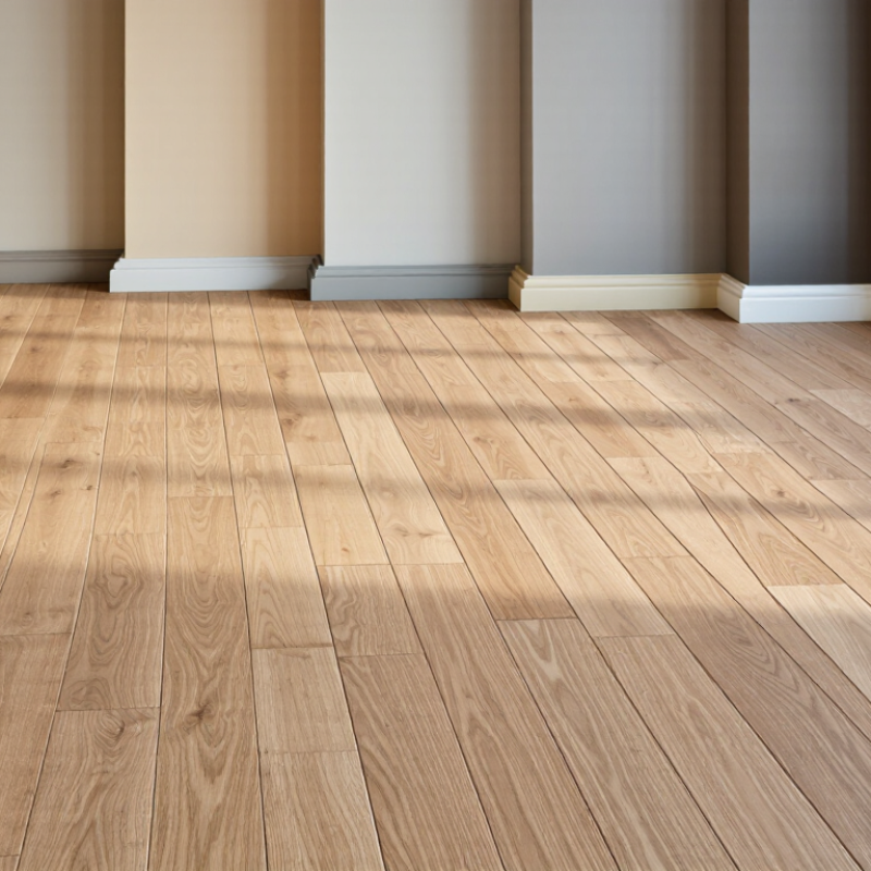
Top 10 Ways to Choose Trim Color That Matches Flooring
CIE L* measures perceived lightness on a scale from 0 to 100. Zero represents absolute black, while 100 represents perfect white. When choosing trim, compare its L* value with the flooring under consistent lighting. A floor near L* 35 usually needs trim with a clearly different value, such as L* 65, to create visible definition. Smaller differences may produce a softer, quieter transition. I have made this mistake before: a trim sample looked bright in a store, then appeared dull beside darker flooring.
Lightness alone cannot reveal every undertone. Review the a* and b* values in the CIE L*a*b* system when possible. Positive b* suggests yellow, while negative b* suggests blue. Positive a* indicates red, and negative a* indicates green. Warm wood flooring may need trim with a related undertone, not merely a matching L* value. Surface texture can also distort visual judgment. Matte flooring often absorbs light, while polished flooring reflects it. Test samples beside the floor at morning and evening.
Tips: Measure clean, flat areas with a calibrated color instrument. Avoid measuring near knots, grout, shadows, or strong reflections. Place three trim samples directly against the flooring. Record their L*, a*, and b* readings. Then inspect them from standing height. Numbers guide the decision, but they do not replace observation. Recheck the result.
Compare the flooring’s CIE L* lightness value with a coordinated trim target. CIE L* ranges from 0 (black) to 100 (white); undertone descriptions help guide warm, cool, or neutral color matching.
The flooring values are representative CIE L* reference readings for common visual color groups. Actual readings vary with finish, lighting, texture, and installation conditions.
Top 10 Ways to Choose Trim Color That Matches Flooring
The 60-30-10 rule gives trim selection a practical structure. Use 60% for walls and large surfaces, 30% for flooring and major furniture, then 10% for accents. Trim usually belongs near the 10% layer, but it can also support the dominant 60%. For warm oak flooring, creamy white or muted greige trim often feels connected. Bright white may look harsh beside honey-toned boards. Test a 12-inch sample beside the floor, wall, and daylight. Artificial light can change everything.
The National Association of Realtors’ 2022 Remodeling Impact Report gave interior painting a Joy Score of 10 out of 10. It also estimated a 107% cost recovery. That data supports careful paint decisions, though trim alone will not create the same return. In my projects, matching trim to the floor usually makes narrow rooms feel calmer. Matching it to the wall can make ceilings appear higher. Neither choice works everywhere.
Keep contrast intentional. A dark floor with pale trim creates a crisp border, while similar tones produce a quieter transition. Choose satin or semi-gloss for durability, especially near entryways. I sometimes break the 60-30-10 rule when the architecture demands it. A historic room may need darker trim. That can look wrong at first. Live with the sample for two days. Then reconsider it.
| No. | Flooring Condition | Recommended Trim Direction | 60-30-10 Color Role | Practical Selection | Why It Works |
|---|---|---|---|---|---|
| 1 | Warm oak, honey pine, or golden wood | Use warm white, soft cream, or a muted beige. | 60% dominant neutral; 30% supporting warm tone | Choose trim with a creamy or slightly yellow undertone rather than a blue-white. | Matching the floor’s warmth prevents the trim from appearing stark or disconnected. |
| 2 | Cool gray wood, concrete-look tile, or gray stone | Use clean white, cool off-white, or a soft gray. | 60% cool neutral; 10% accent for visual contrast | Avoid strongly yellow cream unless the room already contains warm furnishings. | A similar undertone keeps the architectural details visually calm. |
| 3 | Dark walnut, espresso, or charcoal flooring | Use a light neutral to create clear but balanced contrast. | 60% light background; 30% floor or furniture tone | Select warm white for brown floors and neutral white for charcoal floors. | Light trim visually defines the wall-to-floor transition without competing with the floor. |
| 4 | Pale maple, ash, light birch, or blond flooring | Use white, light greige, or a slightly deeper neutral. | 60% light neutral; 30% medium supporting color | Use a trim shade with enough value contrast to remain visible. | A very similar pale trim may visually disappear, while moderate contrast adds definition. |
| 5 | Flooring with mixed warm and cool tones | Choose a balanced neutral such as soft greige. | 60% unifying neutral; 30% stronger room color | Identify the undertone repeated most often, then select trim one step quieter. | A restrained neutral bridges competing undertones instead of emphasizing one side. |
| 6 | Patterned tile, terrazzo, or multicolor flooring | Use a quiet trim color drawn from the least dominant floor tone. | 60% quiet base; 10% accents reserved for accessories | Avoid matching the boldest color in the floor unless a dramatic look is intended. | Simple trim allows the flooring pattern to remain the focal point. |
| 7 | Natural stone with visible veining | Match the stone’s background color rather than its darkest vein. | 60% background neutral; 30% secondary material color | Compare trim samples beside both the light base and the strongest vein. | The background tone creates continuity without making the trim look overly heavy. |
| 8 | Small room with limited natural light | Use a light, low-contrast trim color close to the wall. | 60% light base; 30% floor tone; 10% restrained accent | Avoid very dark trim unless the room is intentionally designed for strong framing. | Low contrast reduces visual interruption and helps the room feel more continuous. |
| 9 | Open-plan space with different flooring zones | Use one adaptable trim neutral throughout the connected areas. | 60% shared neutral; 30% zone-specific color; 10% accents | Select trim that complements the most visible flooring and works with the adjacent zones. | Repeating trim provides continuity when flooring changes between spaces. |
| 10 | Historic, traditional, or high-contrast interior | Use trim as a deliberate framing color that repeats elsewhere. | 30% supporting architectural color; 10% intentional accent | Repeat the trim color on doors, built-ins, window frames, or selected furniture. | Repetition makes a contrasting trim choice look planned rather than mismatched. |
| 60-30-10 Guideline: Use approximately 60% for the dominant room color, 30% for a supporting color or material, and 10% for accents. Treat the rule as a flexible visual-balance guide, then confirm the trim beside the actual flooring in both natural and artificial light. | |||||
Choosing trim by color name alone can mislead you. Flooring is usually the largest fixed surface, so compare its Light Reflectance Value, or LRV, with the trim sample. ASTM E1477 describes reflectance as a measurable optical property. The LRV scale runs from 0, nearly black, to 100, nearly white. A practical 30-point contrast guide creates visible separation without automatically making the room feel divided.
For example, flooring with an LRV of 35 may pair comfortably with trim near 65. This difference often outlines baseboards, doors, and stair edges clearly. However, it is not a universal rule. The Illuminating Engineering Society explains that illumination, surface reflectance, and surrounding colors affect visual appearance. A glossy floor can appear brighter than its measured value. I have also seen warm wood make cool white trim look harsher than expected. That result deserves a second look.
Tips: Measure flooring and trim samples under morning, afternoon, and evening light. Use a handheld colorimeter when possible, then confirm the result beside the actual floor. Keep the LRV gap near 30 points in bright, open rooms. Try a smaller gap in compact spaces. A 15-point difference may feel calmer. Check undertones, too. A technically correct LRV can still fail when beige flooring meets blue-gray trim. Review the samples from several angles, because texture and sheen can change perceived contrast.
Choosing trim to match flooring involves more than comparing color chips. Sheen changes how both surfaces appear under daylight, lamps, and hallway shadows. ASTM D523 offers a practical reference for this decision. It measures specular gloss, or reflected light, using defined viewing geometries. The standard commonly uses 20°, 60°, and 85° angles. Each angle suits a different gloss range.
A 60° reading is the general starting point for many painted surfaces. A 20° reading helps separate high-gloss finishes, while 85° reveals differences in low-gloss materials. Results are reported in gloss units, not as a universal shine score. Flooring with 18 GU at 60° may look calmer beside trim at 25 GU than beside trim at 70 GU. Yet texture, grain, dust, and light direction can distort visual comparisons. Numbers guide the eye; they do not replace it. Measure when possible.
Bring flooring and trim samples into the actual room. Clean both surfaces, place them beside a window, and inspect them from several steps away. Ask a coatings professional or testing laboratory for comparable gloss measurements when the match matters. Keep color temperature consistent. Warm bulbs can make satin trim appear softer than it is. I once trusted a sample card under showroom lighting and chose too much sheen. The result highlighted every small wall wave. That mistake still matters: coordinate reflectance, but respect surface flaws and maintenance needs. A slightly lower trim gloss often looks more intentional than a perfect numerical match.
Choose ten trim samples before committing to one color. Include warm white, cool white, soft beige, gray, and two deeper tones. Place each sample beside the flooring, not on a separate wall. Check them under daylight, LED, and incandescent lighting at different times.
Daylight exposes blue or yellow undertones. LED bulbs can make white trim appear sharper, especially at higher color temperatures. Incandescent light adds amber warmth. The U.S. Department of Energy reports that LED lighting uses at least 75% less energy and lasts up to 25 times longer than incandescent lighting. That makes LED evaluation especially important in modern homes. Check the bulb’s color temperature and color-rendering rating, too. A sample may look balanced at noon, then appear green near sunset. I once rejected a suitable trim color because I judged it under only one lamp.
Look closely.
Tips: View all ten samples at 9 a.m., 2 p.m., and after sunset. Hold samples vertically against the baseboard and flooring. Test corners, door casings, and shadowed areas. Compare satin and semi-gloss finishes, because sheen changes perceived brightness. The Illuminating Engineering Society emphasizes evaluating colors within their actual lighting environment, not only under showroom lamps. Record each sample’s appearance and remove the weakest choices slowly. My judgment still becomes less certain at night, so I leave the final sample in place for 48 hours.
CIE L measures perceived lightness from 0, nearly black, to 100, nearly white. Compare both materials under the same lighting. A floor near L 35 may suit trim near L 65. This difference creates visible definition. Smaller differences feel softer. Test again.
No. Lightness does not reveal every undertone. Check a and b values when possible. Positive b suggests yellow, while negative b suggests blue. Positive a suggests red, while negative a suggests green. Warm flooring may need trim with a related undertone.
A difference near 30 points often creates clear separation. For example, flooring with an LRV of 35 may pair with trim near 65. A 15-point difference can feel calmer in compact rooms. The guide is useful, but not universal. Surrounding colors and lighting can change the result.
Undertones, texture, sheen, and lighting affect perceived color. Warm flooring can make cool white trim look harsh. Glossy flooring may appear brighter than its measured value. Numbers guide the choice. They do not replace observation.
Test ten samples before making a final decision. Include warm white, cool white, soft beige, gray, and deeper tones. Place every sample directly beside the flooring. Hold samples vertically near baseboards and door casings. Look closely.
Check samples in daylight, LED lighting, and incandescent lighting. View them around 9 a.m., 2 p.m., and after sunset. Daylight can reveal blue or yellow undertones. LED lighting may make white trim appear sharper. Incandescent lighting adds amber warmth.
Use a calibrated color instrument on clean, flat areas. Avoid knots, grout, shadows, and strong reflections. Record the L, a, and b readings for each sample. Then inspect the samples beside the actual floor. The measurement may still miss a visual problem.
Leave the strongest sample in place for at least 48 hours. View it from standing height and several angles. Check corners, shadowed areas, and door openings. Compare matte, satin, and semi-gloss finishes. I still become less certain at night. That uncertainty matters.
Choosing trim that complements flooring begins with evaluating the floor’s undertone and lightness. Use the CIE L* scale, which ranges from 0 for absolute black to 100 for absolute white, to understand whether the flooring appears warm, cool, light, or dark. Then apply the 60-30-10 color-balance rule: let the flooring support the dominant color, use walls and furnishings as secondary tones, and reserve trim for a controlled accent. Comparing the flooring and trim’s Light Reflectance Values can also help; a difference of about 30 points often creates clear, attractive contrast without feeling harsh.
When deciding how to choose trim color that matches my flooring, consider sheen as carefully as color. ASTM D523 gloss-measurement principles can guide whether a matte, satin, or glossier finish will harmonize with the floor’s surface. Finally, test at least ten trim samples beside the flooring in daylight, LED light, and incandescent light. Observe them at different times of day, since lighting can significantly change undertones, contrast, and the overall balance of the room.

Green Earth Wood